Herzog Dupont for YOOtheme Pro Documentation
Requirements
-
Joomla! 3.9/Joomla! 4.0 or WordPress 5.4
-
PHP 7.4
-
YOOtheme Pro 2.7.0
Installation
Joomla! 3
-
download the installation package from the Joomla! Extension Directory
-
install it via the Joomla! extensions manager at Extensions 🠖 Manage 🠖 Install
Joomla! 4
-
download the installation package from the Joomla! Extension Directory
-
install it via the Joomla! extensions manager at System 🠖 Install 🠖 Extensions
WordPress
-
download the installation package from the WordPress Plugin Directory
-
upload & install it via the WordPress Plugins screen
-
activate the plugin
Elements
Work in progress
Counter Element
Text | Text that will be displayed underneath the counter. |
Number | The number to which the counter should count up. |
Unit | Text that will be displayed after the counter. This can be also be used to display a unit next to the number. |
Separator locale | This setting will apply a language-sensitive representation of this number. Basically, it is used to show a separator for thousands, e. g. if None would show 1000000, English (U.S.) – comma would show 1,000,000 and German (Germany) – full stop would show 1.000.000. |
Percentage | Set the percentage of the circle that should be filled when the animation is complete. |
Circle radius | Set the radius for the circle in px, i. e. how large the circle should be drawn. |
Circle stroke width | Set the stroke width for the circle in px. |
Duration | Set the animation duration in ms, i. how long it takes to draw the circle and count up the number. |
Circle color | Set the color for the circle. Click on the color preview field to open the YOOtheme Pro color picker. |
Flipcard Element
Image Comparison Element
Lottie Element
Animation Path | This is the path to the source file for the Lottie animation. You can either use the file picker or enter a URL directly. The file has to be a Lottie JSON file, i. e. an Adobe After Effects animation that has been exported with the Bodymovin plugin. |
Trigger | Choose the animation trigger. Autoplay: The animation will start once it is loaded. In View: The animation will start once it reaches the viewport. Click: The animation will start when a click event is triggered on the element. Mouse Enter: The animation will start when a mouseenter event is triggered on the element. Scroll: The animation frames will be shown according to the scroll position. None: The animation will not be started by the plugin, this can be used for custom scripts. |
In View Top Offset | Set the top offset for the in view trigger. Requires the trigger to be set to In View. |
Loop | Choose whether the animation should be played once or in a loop. Not available if the trigger set to Scroll. |
Speed | Set the play speed for the animation. |
On Mouse Leave | Choose whether or not the animation shall pause on mouse leave. Requires the trigger to be set to Mouse Enter. |
Animation Start | Set the start point of the animation. This value is a percentage of the total animation frames. |
Animation End | Set the end point of the animation. This value is a percentage of the total animation frames. |
Renderer | Select the HTML element the lottie animation will be rendered with. |
Animation Name | Set an animation name to reference the animation in custom scripts. This can be used to programatically control a lottie animation. E. g. if you have set mylottie as animation name, you can start the animation with lottie.play('mylottie') and pause it with lottie.pause('mylottie'). See the Lottie for Web GitHub repository for a list of available methods. |
Progress Element
Slideshow Grid Element
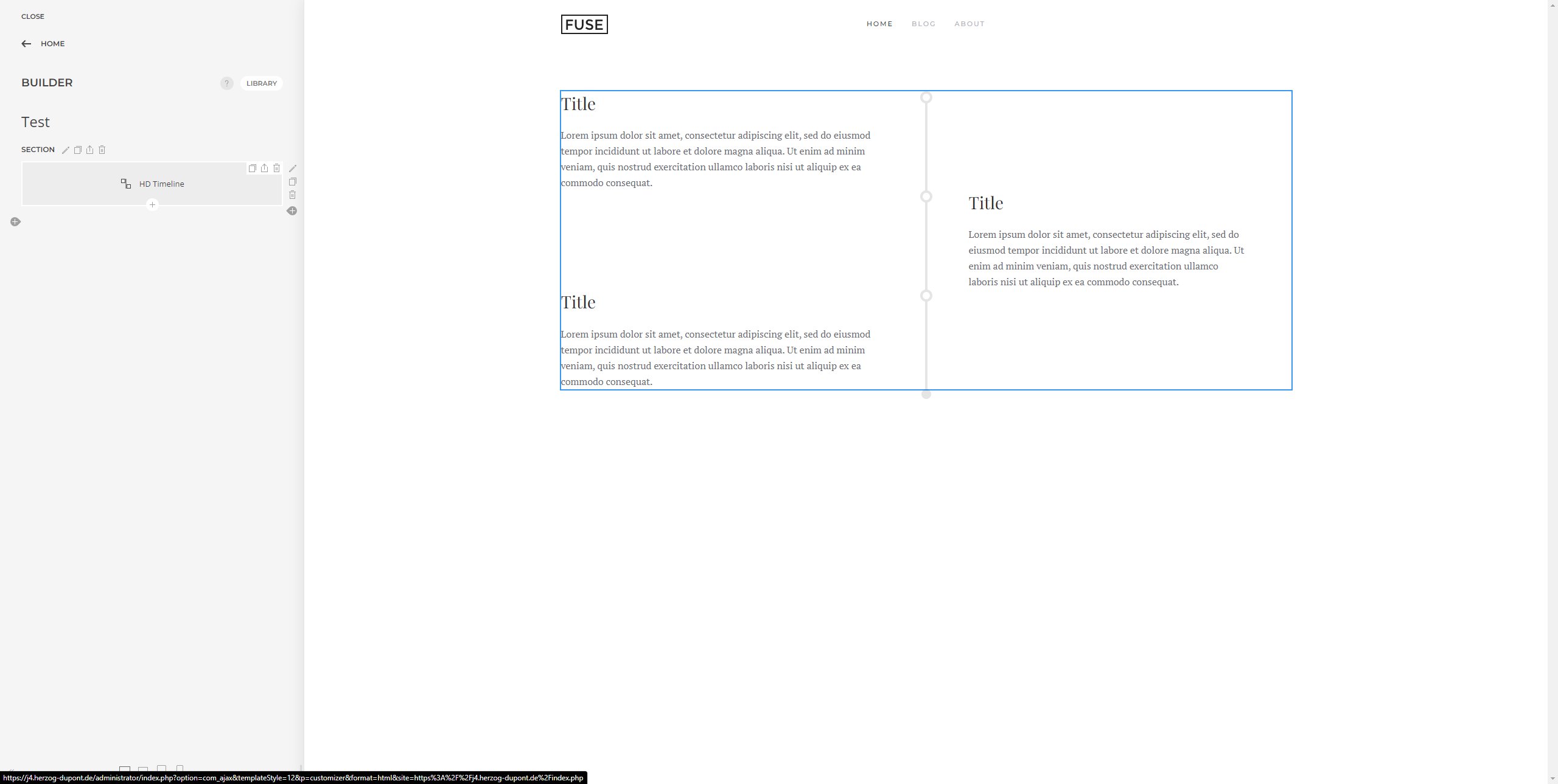
Timeline Element
Line Color | Set the color for the timeline. This setting will override the default setting from the style customizer. |
Timeline Icon Color | Choose the color for the icon that is shown on the timeline. |
Timeline Icon Border Color | Set the border color for the timeline icon. |
Timeline Icon Background Color | Choose the background color for the icon that is shown on the timeline. |
Item Alignment | Choose the timeline item alignment. Left: All items are aligned to the left. Right: All items are aligned to the right. Left Alternate: The first item is aligned to the left, the second to the right, the third to the left…. Right Alternate: The first item is aligned to the right, the second to the left, the third to the right…. Inherit: Apply the same setting as for the breakpoint above. The breakpoints are defined in the style customizer at Style 🠖 Global 🠖 Breakpoints. Here you can also set the top margin for the timeline items to define how much space shall be shown between the timeline items. |
Style Customizer Settings
Line Color | Set the color for the timeline. This setting can be overridden by the element setting. |
Line Width | Set the width for the timeline. The timeline icon border width will be automatically calculated based on this setting. |
Item Container Padding | Set the container padding for the timeline items. |
Timeline Icon Background Color | Choose the background color for the icon that is shown on the timeline. |
Item Alignment | Choose the timeline item alignment. Left: All items are aligned to the left. Right: All items are aligned to the right. Left Alternate: The first item is aligned to the left, the second to the right, the third to the left…. Right Alternate: The first item is aligned to the right, the second to the left, the third to the right…. Here you can also set the top margin for the timeline items to define how much space shall be shown between the timeline items. |
Toggle Element
Content | Content that will be displayed before the toggle button. If you don’t need content before the toggle but, simply delete the placeholder text and leave this field empty. |
Advanced | Content that will be displayed after the toggle button. This is the content that will be toggled by default to show/hide when clicking the button. |
Mode | Set the trigger behaviour mode. A toggle can be triggered in different ways: on hover, on click or based on the on the viewport width. You can also choose a combination of the three options. |
Hide Content 2 on load | If checked, Content 2 will be be hidden on page load. If the toggle is then triggered, it will show Content 2. If unchecked, Content 2 will be visible on page load and once the toggle is triggered, Content 2 will be hidden. If you want to apply a custom class to Content 2 instead of showing/hiding it, uncheck this option. |
Target | Set a CSS selector for the HTML element(s) of which you want to toggle a class (defined in setting `Cls`). Content 2 must be empty to use this setting. |
Cls | The class that is being toggled on the target. If not set, the `hidden` attribute will be toggled. |
Settings
Counter Element | If checked, the Counter Element will be added to the element library. |
Flipcard Element | If checked, the Flipcard Element will be added to the element library. |
Image Comparison Element | If checked, the Image Comparison Element will be added to the element library. |
Lottie Element | If checked, the Lottie Element will be added to the element library. |
Progress Element | If checked, the Progress Element will be added to the element library. |
Slideshow Grid Element | If checked, the Slideshow Grid Element will be added to the element library. |
Timeline Element | If checked, the Timeline Element will be added to the element library. |
Toggle Element | If checked, the Toggle Element will be added to the element library. |
Uninstall
Joomla! 3
-
in your Joomla! admin panel, navigate to Extensions 🠖 Manage 🠖 Manage
-
enter the search term Herzog Dupont into the search field and click on the search button
-
check the entry System - Herzog Dupont and click on the uninstall button
Joomla! 4
-
in your Joomla! admin panel, navigate to System 🠖 Manage 🠖 Extensions
-
enter the search term Herzog Dupont into the search field and click on the search button
-
check the entry System - Herzog Dupont and click on the uninstall button
WordPress
-
in your WordPress admin panel, navigate to Plugins 🠖 Installed Plugins
-
enter the search term Herzog Dupont into the search field
-
click on the deactivate button underneath the entry Herzog Dupont
-
click on the delete button underneath the entry Herzog Dupont
Troubleshooting
Timeline does not work
Elements do not work on a 404 page
Any element that requires assets such as a CSS or JS file does not work on a 404 page, at the moment. The reason for this is that there is a general issue on 404 pages with loading assets via $metadata->set() in custom elements. This problem will occur for any custom element, i. e. of this plugin as well as by any third party. This issue has been confirmed by YOOtheme. Unfortunately, it’s not quite easy to fix, so there is no fix to be expected soon.
As a workaround, you could try to load the assets for the custom elements on your 404 page by adding the following into an HTML element at the top of your template layout:
<script src="https://example.com/plugins/system/herzogdupont/modules/elements/elements/hd-progress/js/hd-progress.js" defer></script>
<link href="https://example.com/plugins/system/herzogdupont/modules/elements/elements/hd-counter/css/hd-counter.css" rel="stylesheet" />
<script src="https://example.com/plugins/system/herzogdupont/modules/elements/elements/hd-counter/js/hd-counter.js" defer></script>
<link href="https://example.com/plugins/system/herzogdupont/modules/elements/elements/hd-flipcard/css/hd-flipcard.css" rel="stylesheet" />
<script src="https://example.com/plugins/system/herzogdupont/modules/elements/elements/hd-flipcard/js/hd-flipcard.js" defer></script>
<link href="https://example.com/plugins/system/herzogdupont/modules/elements/elements/hd-image-comparison/css/hd-image-comparison.css" rel="stylesheet" />
<script src="https://example.com/plugins/system/herzogdupont/modules/elements/elements/hd-image-comparison/js/hd-image-comparison.js" defer></script>
<script src="https://example.com/plugins/system/herzogdupont/modules/elements/elements/hd-lottie/app/lottie.min.js" defer></script>
<script src="https://example.com/plugins/system/herzogdupont/modules/elements/elements/hd-lottie/js/hd-lottie.js" defer></script>
Make sure to replace example.com by your own domain.